Cover Design
The purpose of a book cover is to lure potential readers and convince them to shell out your cover price. To that end, it is must stand out amongst a shelf of other competing tomes – it needs to attract and intrigue.
The cover design includes two primary elements: imagery and typography. The imagery can be a photo, illustration or geometric shapes but in any case, it must be true to the nature/spirit of the book. If it is a dark mystery, bright playful designs would be inconsistent unless the underlying intent is one of contradiction. The cover design should be a precursor of what’s in store.
The typography on the cover usually comprises just three things: the title, subtitle (if any) and the author name. The title can appear at the top or bottom but in any case, above your name so it is the first thing people read.
Sources of Design Ideas
One of the easiest ways to get inspiration for the cover design is by looking at other book covers and one of the simplest ways to do it is by browsing the pages of Amazon and other on-line book stores. You’ll see there are common characteristics, especially within genres. Your book cover should observe the tenets of good design without simply duplicating a successful source.
Specific Recommendations
Here are some things to keep in mind whether you are designing the cover yourself or assessing the work done by your designer.
Ensure that there is sufficient contrast between type and illustration so that legibility is not comprised. Do the six-foot or ten-foot test. Holding the cover several feet away, assess whether it can still be easily read.
Is it memorable or does it blend in with all others on the shelf? Originality is typically rewarded with improved sales.
It’s a good idea to hint at the theme of the book and sometimes feature the main character on the cover but do so carefully so not to disclose everything.
If you are working with a designer you should be open to their suggestions and have at least a couple of layouts created before you finalize anything.
Design Requirements – Technical Considerations
In addition to meeting aesthetic and marketing considerations, your book cover must meet specific technical requirements in order to be printed and finished correctly. Here are some of the basic standards which vary with the type of book you are producing and most importantly the binding method.
Wrap Covers
Wrap covers surround the book and comprise the front, back and spine. This is the format used in stapled (on spine) and perfect (glue) bound books. It is also the format for dust jackets on hardbound books.
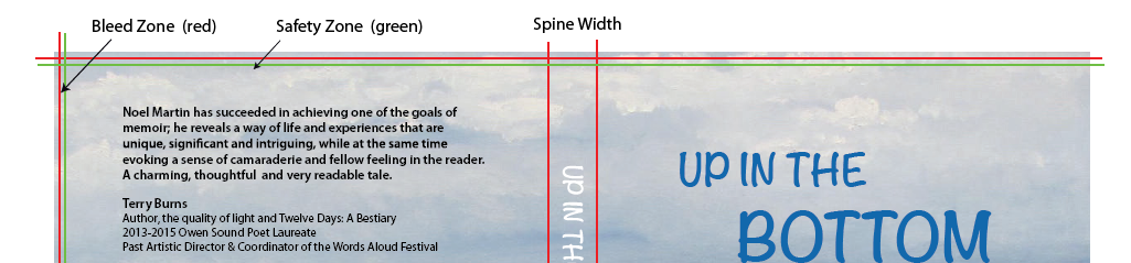
With wrap covers, the design frequently extends from the front to the back with the whole being a single large format graphic. The spine is the space between the front and back and varies with the thickness of the book. The thickness is the result of the page count, paper thickness and cover thickness. In order to properly determine the accurate spine depth in your design you can measure a stack of the same paper equal to the total pages and cover being used in your book. Simpler yet is to reach out to us for an estimate.
Design Requirements
These files should be submitted full width including spine. If there is printing on the inside cover, the document should have two pages or be submitted as two files.
- Allow a .125” bleed zone on all edges of the cover, even if artwork does not bleed over the edges.
- Include the spine depth in the design.
- Keep content a minimum of .25” from the outer edges of the cover.
Single Panels
Single panels (front & back) are used on books that have an open spine and are bound using methods such as spiral coil, wire coil and cerlox. This binding method is popular for instructional books, manuals, cook books and other documents that need to lay flat when used.
Design Requirements
These files need to be submitted in the form of a 2 page PDF or individual files for the front and back with file names that clearly indicate which is which.
- For two page files, include the front first the back second.
- Allow a .125” bleed zone on all edges of the cover, even if artwork does not bleed over the edges.
- Allow for the binding material on the spine edge in your design. Allow at least .25” to .375” from the spine edge before starting text or important parts of the illustration. Otherwise you may have holes punched through important text.
Jackets
The jacket wraps around the hardcover book and carries the design . The actual hardcover is generally a combination of fabric and hardboard, may be embossed and has little type save for the title on the spine and perhaps the cover. The jacket most be as long as the open cover including spine and needs extra which folds around the edge into the book. For example, on a 6 x 9” format, the open width would be 12”. Add to this the spine and fold-over (front & back) for a length of 19”.
Design Requirements
The requirements for these covers are virtually the same as for a wrap cover on a paperback.
Back Cover
The back cover is not simply dead space. It is useful for marketing and carrying required information such as the ISBN and barcode. Sometimes the background illustration of the front cover wraps to the back but it can be different.
Here is a list of the standard inclusions which you can select from as it is unlikely there is room for them all.
- A short description of the book which serves as both information and teaser without giving away the plot
- Reviews from credible sources.
- A short bio of the writer – tasty bits that are relevant to the book in hand.
- The ISBN number and barcode should be considered mandatory and placed in the bottom ¼ of the cover.
Inside Covers
Inside covers can be useful if there is additional information to communicate to readers. We have had some authors used this space to promote other books, artworks or other business interests. There are no real rules for what is acceptable and printing can be in colour or black only.
Spine
The spine is the only way potential readers will be able to pick it off the shelf but space is limited, especially if it is 150 pages or less. The title should appear at the top in the largest type followed by the author name and the publisher imprint. Type should run horizontally on the spine not vertical which can be very hard to read. Pick contrasting colour so it stands out.